

Council approves new logo for city tourism
New branding goes in effect in February
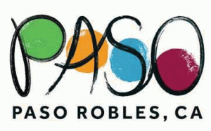
Paso Robles’ new tourism logo will be launched in 2015.
The Paso Robles City Council approved a new tourism logo proposed at its meeting on Tuesday. The design was approved by Tourism Collaboration Committee, whose duty is to advise the city council on all matters relate to tourism in the city and previously known as the Promotions Coordinating Committee, and Travel Paso Robles Alliance.
“The TTC has initially express its concern with certain elements of that logo,” Paso Robles Assistant City Manger Meg Williamson said.
The logo change, Travel Paso Robles Alliance Destination Manager Amanda Diefenderfer said, will only affect the logo used in tourism efforts, not the city’s seal logo or the chamber’s. “This to reach the outside visitor.”
The original tourism logo will be phased out.
The original logo was selected by the Promotions Coordinating Committee in 2008, a year after both of the committee was formed. The alliance was formed in conjunction with the formation of the Tourism and Lodging Promotions Business Improvement District in 2009. The goal of that project was to create a graphic logo that would be used to represent the look and feel of the marking campaigns for the Paso Robles region.
“Most of you will agree that the one we have now … it’s very confusing, unreadable. And the colors aren’t exciting or interesting,” said Paso Robles Tourism Program member Matt Masia, who formerly served on the Promotions Coordination Committee and admitted to voting in favor of the previous logo, designed by Kraftwerk of San Luis Obispo
The logo is used on the city’s tourism website, www.travelpaso.com. In 2013, the city entered a contract with AugstineIdeas to continue and expand the city’s marketing reach. After the firm’s initial discovery phase, AugustineIdeas recommended that a logo refresh be undertaken. The firm developed logo design and tagline alternatives with input from the alliance’s marketing subcommitee and the alliance itself between March and October.
The collaboration committee reviewed the logo design alternatives at meetings in April and June, but no formal action or recommendations were made then. In August, the council made two new at-large member appointments to the committee. When the committee convened under its membership structure on Sept. 30, it deliberated on the the logo design options and alternative taglines. At its Oct. 16 joint meeting, the alliance request refinement of the logo to make it bit less “whimsical” and to keep the tagline separate.
AugustineIdeas then put the logo to the test. The city’s Travel Paso database as well as email lists from trusted tourism partners — 62,000 recipients — were sent an electronic survey. Six hundred and seventy people replied.
“I love the logo to me it stands for the green the rolling green hills, the yellow for the sunshine, the blue for the sky and nearby
ocean and plum color for all the wineries and vineyards. Such a beautiful area!” one person wrote in the comments section of the anonymous survey. Diefenderfer said that meaning behind the logo was not given to the recipients, but many picked up on it.
“This is hip, man,” Paso Robles Downtown Main Street Association Executive Director Norma Moye said during public comment. “It’s legible. The baby boomers are getting old, the newcomers are coming up, they’ll like this new logo. It’s new, and change is good.”